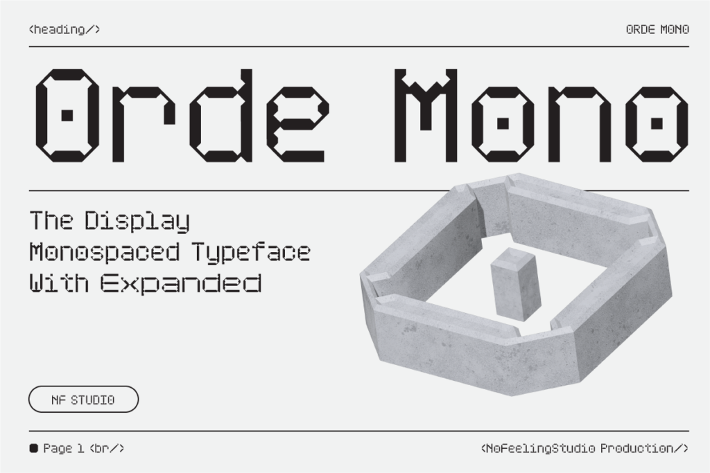
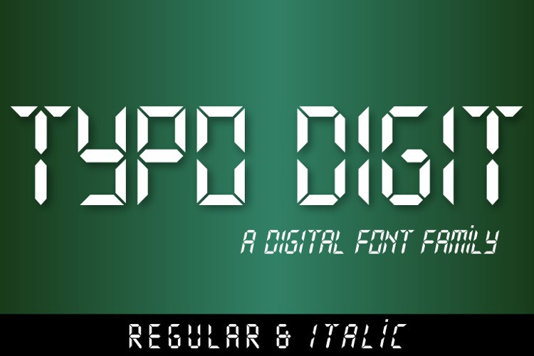
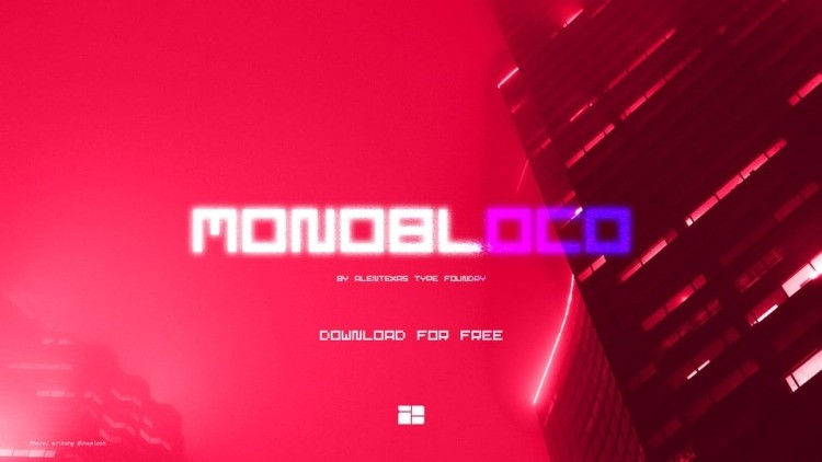
Nothing more than Apple’s renowned system font ”Geneva“ in the bit map representation, but as a PostScript font; aliased like ”Geneva“ in 9 or 10 points, or even in resolutions that are too small, that is, under 8 points; ideal for ”pixely“ topics.
An anachronism in the digital age: While the whole world speaks of progress, the font on the monitor has only ”progressed“ into a non-pleasant-to-read conglomeration of pixels. Each object on a monitor is displayed by lining up individual pixels. These pixels are so tiny, that they are hardly perceivable. The more pixels per surface unit (that means, the higher the resolution), the more the picture perceived by the eye merges into a sharply defined unit.


