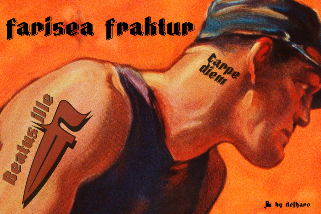
Fraktur is a typographic style of the Latin alphabet derived from the Gothic writing that arose at the beginning of the XVI century and was popularized in Germany, Northern Europe and the Baltic countries. These fonts are distinguished by their thick strokes and the angled profile produced by the pen. Farisea Fraktur is my modern version of this type of Fraktur fonts, without embellishments, the initial inclination is of 64 ° for the upper and lower ascending finials, it has a great contrast between antlers and a generous height of x, which gives the font in a square proportion.