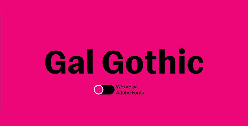
Gal Gothic Sans Serif Font is a humanist variable sans serif font whose main inspiration is the classic Franklin Gothic by Morris Fuller Benton (1904). Franklin’s very moderate stroke contrast is perhaps its most identifiable formal feature, and probably what gives it its own personality, setting it apart from other grotesques of its time. This contrast, however, is much more noticeable in the heavier weights, while the lighter ones have a certain monolinearity. This is probably due to the fact that Benton only designed the heaviest weight, while the rest were added much later, by the hands of Victor Caruso for ITC (1980). Gal Gothic seeks to take this contrast also to the lighter weights, integrating them more consistently into the system. In addition, its horizontal endings and smooth connection between vertical and curved stems, bring this design closer to the neo-grotesque model and, together with the round dots, give it a very different tone of voice compared to the original reference


