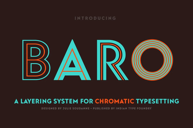
Baro Sans Serif Font is a contemporary geometric sans-serif with angular terminations and amazing X height. Some of the Baro fonts can be layered overtop one another for chromatic typesetting. The base style of the family is the Baro Plain font; all of its characters are comprised of thick, monolinear strokes. Baro Plain can be used on its own as a very heavy geometric sans, or it can be placed as a base behind other Baro fonts*. The characters in the Baro LineOne font are made up of very thin strokes. The letters don’t sit on an even baseline, but bounce up and down along the line of text. In Baro LineTwo, each character is drawn with two parallel strokes – an outline and an inline, with a thick hollow counter space between them. Baro LineThree just is like Baro LinoTwo, but with thicker strokes. Baro LineFour is a stand-alone font; its characters each have thin inline strokes in the center of their ‘backgrounds’ thick monolinear strokes. Baro Contour is yet another font like Baro LineTwo, except that its parallel strokes are even thinner. Finally, Baro Strip is a prismatic version of Baro, which can either stand alone or combine with Baro Plain. In Baro Contour, the ‘strokes’ of each letterform are made up of five parallel lines.

